GTAM Logo Contest!! | Page 6 | GTAMotorcycle.com

GTAM Logo Contest!!

Status
Not open for further replies.
Hey guys, here's one of my submissions. I wanted to create something that would appeal to everyone, no matter what type of motorcycle you ride. Just like GTAM, there's something for everyone. I wanted to keep it simple and in the world of motorcycle iconography.


Really like this design.


Sent from my iPhone - too lazy to use the computer.
 
attachment.php
Best one yet.
 
Unless there's a sub-forum we don't know about, I don't think a prominently displayed ATM would be a good idea.

I like the cruiser/sportbike chimera the best. Reminds me of something from a 70s punk fanzine. Everything else is serviceable, I guess. Looks like second-tier product packaging/student portfolio.

No hate, I just work with the stuff on a daily basis.
 
I agree...this one is the coolest so far...I'd even buy the t-shirt

GTAM1ey3_comp4_zps141090f2.jpg
 
Last edited:
Unless there's a sub-forum we don't know about, I don't think a prominently displayed ATM would be a good idea.

I like the cruiser/sportbike chimera the best. Reminds me of something from a 70s punk fanzine. Everything else is serviceable, I guess. Looks like second-tier product packaging/student portfolio.

No hate, I just work with the stuff on a daily basis.

I'll work up another one that doesn't look like a new night-club bank machine
 
It's G T A M....:D Not sure if you knew this but i see GATM when i look at your picture. I like the simple design as a logo though :thumbup:

Hahahah. I can't believe I didn't even notice that! Doh! Wow. I'll fix it and try at another logo. And have better luck at proofing that too.

GTAM as a logo works better also. "Greater" G surrounding "Toronto Area Motorcycles" seems appropriate.
 
hmmm not sure I am getting the reference....can you explain further? Is it cause he is bothe a "G" and a walking ATM?

not money related.
 
Here is my entry:

gEsCC1j.png


I think a simplistic grey, red and white colour scheme would work well for this site as reflected in my design choice.

Edit:
Due to feedback about the sign not working well with the text I decided to make a revised version.

yE4ZPNs.png

Fq0C9t0.png


I also changed the text so that the G in GTA would be more readable, but it can be changed back to the strike-through at any time.
(Thanks to fastar1 for letting me know the gap between the T and the A looked to wide, it's fixed now in my revised design)

Edit 2:
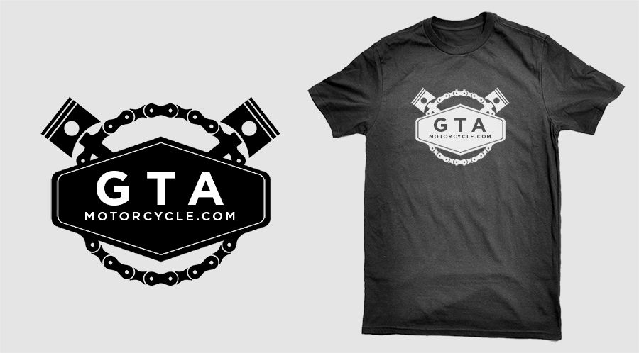
A couple members said I should change the icon to a motorcycle vector that AF4ik used, so I changed it and I think it turned out pretty good. (Not sure if Paul will allow collaborated designs though)

mAyCisb.png


Edit 3: (Hopefully my final edit)
I don't know if my last one can be entered in the contest since I used the vector image AF4ik used, and I took into consideration Paul wants a sport and cruiser logo.

ot064wT.png

TbMbAlG.png

The forth one is really good! Seeing them on the same page, this, the forth down is my fav.
 
Last edited:
The forth one is really good! Seeing them on the same page, this, the forth down is my fav.
I agree, the font is super cool. If not chosen maybe it can be used at the track subforum

No offense to the one Paul posted but it's Meh.
 
Status
Not open for further replies.

Back
Top Bottom