
This is hilarious, should include Jorge Lorenzo crying at a Press conference tableOh yeah, I forgot to put Pedrosa in the logo...


You are using an out of date browser. It may not display this or other websites correctly.
You should upgrade or use an alternative browser.
You should upgrade or use an alternative browser.
GTAM Logo Contest!!
- Thread starter Paul
- Start date
- Status
- Not open for further replies.
EastYork3
Well-known member
I really like the tshirt design. But in my unprofessional opinion I think it would be an awesome shirt for a bike shop?
Not a bash at all. Cause I like it.
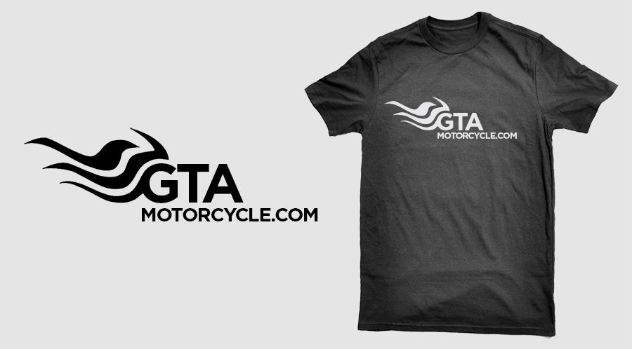
I'll take that as a compliment. I was trying to make something that I'd actually wear on a shirt, or hat, or sticker my bike.

Here's another idea. Thought I'd take a stab at starting from the existing logo and making some changes to freshen it up a bit. Sort of a GTAM 2.0.
I see what you're going for here, but the bike looks like ocean waves at first glance.
BTW, what font is that?
professor
Well-known member
I'll take that as a compliment. I was trying to make something that I'd actually wear on a shirt, or hat, or sticker my bike.
100 percent you should.
-D-
Banned
Here's another idea. Thought I'd take a stab at starting from the existing logo and making some changes to freshen it up a bit. Sort of a GTAM 2.0.
suggestion
shift the entire top section to the right
put motorcycle.com like a winding road under the logo part
also consider changing the GTA to a softer rounder font
you can also just wrap your logo with motorocycle.com but use two motorcycle.com to make the circle
Rebelrider1
Well-known member

Rebelrider1
Well-known member
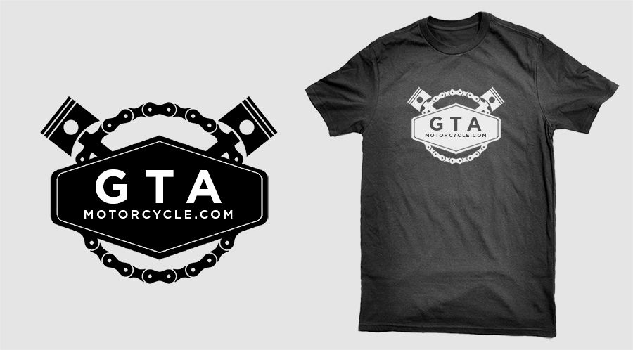
Hey guys, here's one of my submissions. I wanted to create something that would appeal to everyone, no matter what type of motorcycle you ride. Just like GTAM, there's something for everyone. I wanted to keep it simple and in the world of motorcycle iconography.

This one is also hot.
Lightcycle? Troll? Is anybody who makes a joke a troll? I think people are unclear on the concept.
You need to up your game
Sent from my tablet using my paws
-Maverick-
Well-known member
This is hilarious, should include Jorge Lorenzo crying at a Press conference table
And the resulting this:

-Maverick-
Well-known member
These two reflect the site. The second one is interesting as it's an optical illusion done by mistake. Keep it for T-shirts? Either way, the first one has the modern spin and reflects this sportbike dominant site.


Last edited:
N3WMAN
Well-known member
My general idea. I dont have the graphical skills to make it into anything remotely good looking, but you get the idea. If somebody could make it look better that would be great.

I figured with this type of logo you could substitute the sportbike or cruiser quite easily.
I figured with this type of logo you could substitute the sportbike or cruiser quite easily.
Couple of concepts for the sport version. Might try my hand at the cruiser version if I get around to it.

second one, drop the A and make the biker the A
My general idea. I dont have the graphical skills to make it into anything remotely good looking, but you get the idea. If somebody could make it look better that would be great.
I figured with this type of logo you could substitute the sportbike or cruiser quite easily.
Great idea
")

This still isn't professional quality but it shows what I was aiming for. Can be turned into a single colour very easily, and used for t-shirts if the faded background element is removed. Can make two banners from the one image by using just one bike on each.
Last edited:
Yeah, they were pretty sharp.
Here's the thread, but no logos, they were edited out...
http://www.gtamotorcycle.com/archiv...-gt-gt-gt-gt-gt-gt&highlight=gtam+logo+design
Can somebody please track down the guy from the above link? His design blew all the others out of the water.
Can somebody please track down the guy from the above link? His design blew all the others out of the water.
anyone have images of his logo design?
- Status
- Not open for further replies.