GTAM Logo Contest!! | Page 2 | GTAMotorcycle.com

GTAM Logo Contest!!

Status
Not open for further replies.
Here is my entry:

gEsCC1j.png


I think a simplistic grey, red and white colour scheme would work well for this site as reflected in my design choice.
________________________________________________________________________________________________
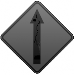
Although I personally think a different sign logo would be more realistic about the roads we have in the GTA:

FIXED

fixed.png

:lol:

In all seriousness, the text design is nice. Agree with professor about the twisty sign though.
 
Just an FYI to those that don't already know. Our existing logo (the bikes) was created by a member.

Time for an update / time for a possible change. We look forward to all the submissions.

Paul and I will narrow down the top five that we feel would work best for us and then we'll put it to a vote here.

Interestingly the existing bike image is very similar to a logo used by BMW Motorad..

Sent from my HTC One using Tapatalk
 
Like it, very good. But... I would try closing the gap in the A to help showcase the gap that runs across all the letters.
 
Like it, very good. But... I would try closing the gap in the A to help showcase the gap that runs across all the letters.

That gap is just how the font is, but it would be easy to close the gap manually

Edit: I fixed it
 
Last edited:
Couple of concepts for the sport version. Might try my hand at the cruiser version if I get around to it.


4uyy.jpg

5yi3.jpg

ev4a.jpg

is6r.jpg
 
Last edited:
Matt, lettering i like. Try replacing the twisty sign with af4's idea of the motorcyclist taking a curb?
 
PLease don't use a tach on the logo. It is by far the most overplayed image in auto history :)

I have a few ideas but can bearly draw a stick figure. anyone want to partner up :)
 
PLease don't use a tach on the logo. It is by far the most overplayed image in auto history :)

I have a few ideas but can bearly draw a stick figure. anyone want to partner up :)

Hahahah me neither ! I may have a few tattoos! One time I was trying to explain something to my artist. He didn't get it so asked me to try and draw It out. For about 30 seconds in, he grabbed the pencil and said you know what, let's get back to explaining!
 
As above, the picture component needs something else, not a tach, sign....

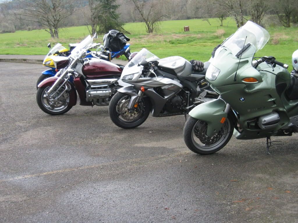
i'm thinking a line up of various types of bike something along the lines on the below picture blending into the lettering . This captures teh cruiser, touring, sport, componment? Maybe somebody can create convert to a more usable graphic to go with the lettering?

137_3707.jpg
 
Last edited:
As above, the picture component needs something else, not a tach, sign....

i'm thinking a line up of various types of bike something along the lines on the below picture blending into the lettering . This captures teh cruiser, touring, sport, componment? Maybe somebody can create convert to a more usable graphic to go with the lettering?

137_3707.jpg

I agree and disagree. Think your onto something when it comes to a t-shirt with your idea. It can be interchangeable based on what you ride and or want.
Having 4 plus bikes on the logo may be a bit busy??
 
I agree and disagree. Think your onto something when it comes to a t-shirt with your idea. It can be interchangeable based on what you ride and or want.
Having 4 plus bikes on the logo may be a bit busy??

I respect and agree with your right to agree and disagree :D

I think there could merit in the concept, just not sure on how to execute :p It would need to be extremely simplified, but still remain meaningful and legible. i know this is a tall order
 
Hahahah me neither ! I may have a few tattoos! One time I was trying to explain something to my artist. He didn't get it so asked me to try and draw It out. For about 30 seconds in, he grabbed the pencil and said you know what, let's get back to explaining!

LOL I have my share of Tattoo work (leg, back,both arms) and I assure you the only thing I drew was cash from the ATM.
 
Matt, lettering i like. Try replacing the twisty sign with af4's idea of the motorcyclist taking a curb?

Exactly...make the bike grey like the lettering
 
Paul, you banned most of the creative people
 
Status
Not open for further replies.

Back
Top Bottom