You are using an out of date browser. It may not display this or other websites correctly.
You should upgrade or use an alternative browser.
You should upgrade or use an alternative browser.
Any GTAM'ers own an electric vehicle?
- Thread starter PrivatePilot
- Start date
at least we'll get the choice when we go ev

 www.abc.net.au
Why Chinese-made cars are becoming so common on Australia's roads
The rapid rise of Chinese electric vehicles has been met with resistance in the US and Europe. So why are Australians buying them at record levels?
Somewhere I heard Chinese EVs had big tariffs on them. BYD, Build Your Dream is their largest manufacturer IIRCat least we'll get the choice when we go ev

Why Chinese-made cars are becoming so common on Australia's roads
The rapid rise of Chinese electric vehicles has been met with resistance in the US and Europe. So why are Australians buying them at record levels?www.abc.net.au
Somewhere I heard Chinese EVs had big tariffs on them. BYD, Build Your Dream is their largest manufacturer IIRC
That's for USA (soon - not yet - I don't know the proposed dates). Not Australia. I don't know how Australia taxes imported motor vehicles, but (sadly) Australia no longer has a domestic auto industry, so they're all imported. If they're all imported, might as well import them from someplace cheap.
Relax
Well-known member
This motorcyclist broke the Cybertruck's mirror:
Looks like they barely had to use any effort to break it off.
Lightning vs. Clustertruck
CER – Market Snapshot: Zero emission vehicles now account for over 10% of all new vehicles in Canada
Market Snapshot: Zero emission vehicles now account for over 10% of all new vehicles in Canada
At least this metric seems to mean something. I still remember the crapshow that was Partial Zero Emission Vehicles that never had zero emissions ever it was just a greenwashing scam.CER – Market Snapshot: Zero emission vehicles now account for over 10% of all new vehicles in Canada
Market Snapshot: Zero emission vehicles now account for over 10% of all new vehicles in Canadawww.cer-rec.gc.ca
I saw the hummer monstrosity going down the 404 Last week. That may be the first time I've seen one in the wild.First spotting of a Silverado EV in the wild, in Listowel this morning.
I'm on the way to CSBK at Grand Bend. At Timmies in town. Car is plugged into a Chargepoint fast-charger while I finish this coffee.
Have seen one in our neighbourhood a handful of times so someone nearby owns one.I saw the hummer monstrosity going down the 404 Last week. That may be the first time I've seen one in the wild.
It’s massive.
As a general purpose station, there is no way it would work. For some fleet applications it could work well. Cops, taxis, etc that keep identical vehicles on the road many hours a day while changing out drivers may be well served by battery swap. That allows charging over time instead of dc fast charge or double the fleet size.Wow, that's quicker than a gas fill-up ... of course you won't see those everywhere like you do gas stns.
That particular system has a crazy amount of moving parts, steps and raising/lowering vehicle. I have no idea how they made it to a physical station with that design.
The concept of battery-swapping only looks nice until you try to do it.
Every battery-swap station has to have on hand, multiple units of every conceivable battery configuration for every conceivable vehicle that could come in for a swap. It follows that this only works in practice if every vehicle had identical battery configurations, or at most a small number of potential configurations ... any more than three or four different battery physical sizes (realistically, one ...) and the logistics explode. And this has to be across all vehicle classes and all manufacturers.
The range of these vehicles is no different from any other EV, so you would need these everywhere.
You still need the electricity to recharge the batteries ...
It works for Nio (one manufacturer building a very limited range of vehicles which all use the same battery) in densely-populated China.
Proper fast-charging is a better solution.
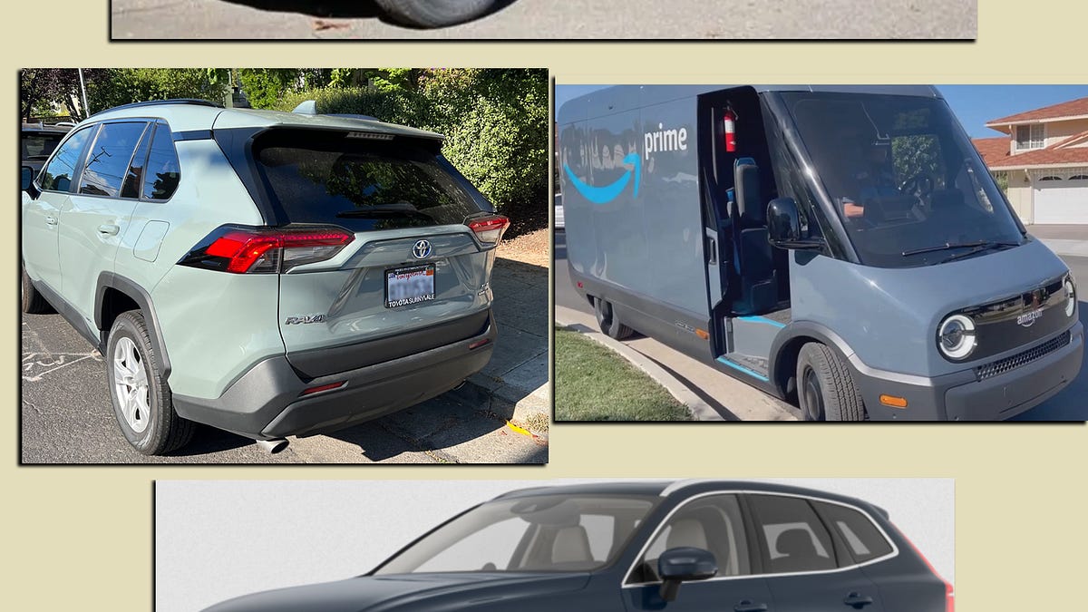
Question for Brian off topic. What's with the flat solid colour paint jobs on so many new vehicles. eg
so many 2023/24 here with those kind of colours.
This is a good summary of the shift

 www.blackbirdspyplane.com
I thought maybe there was a technical advantage.
This is a good summary of the shift

Why do new cars look like this??
"Wet Putty" whips are everywhere. What’s behind it? ... a BBSP investigation
Relax
Well-known member
Question for Brian off topic. What's with the flat solid colour paint jobs on so many new vehicles. eg
so many 2023/24 here with those kind of colours.
This is a good summary of the shift
I thought maybe there was a technical advantage.
Why do new cars look like this??
"Wet Putty" whips are everywhere. What’s behind it? ... a BBSP investigationwww.blackbirdspyplane.com

Just a guess, but my opinion is that it's much like beards and long hair coming back because of COVID-19. At some point enough people were half-assing their paint jobs due to lack of funds, starting with flat black paint on an individual panel, evolving to Plasti-dipping the entire car (originally only available in flat), and the trend just caught on enough that brand new cars were being plasti-dipped, so manufacturers must have felt there was an opportunity. I still remember when BMW came out with their Frozen Grey back in 2010 and I thought it was the coolest thing. Now, not so much since everyone is doing it.
The cynical part of me wonders if this is a ploy to sell more replacement panels. Flat paint is very unforgiving.Just a guess, but my opinion is that it's much like beards and long hair coming back because of COVID-19. At some point enough people were half-assing their paint jobs due to lack of funds, starting with flat black paint on an individual panel, evolving to Plasti-dipping the entire car (originally only available in flat), and the trend just caught on enough that brand new cars were being plasti-dipped, so manufacturers must have felt there was an opportunity. I still remember when BMW came out with their Frozen Grey back in 2010 and I thought it was the coolest thing. Now, not so much since everyone is doing it.
As with most recent changes to vehicles, it drives up cost of repairs. I think 20% of crashed vehicles are write-offs now and that will be climbing fast. Cage owners will soon feel the pain that riders have felt in Ontario for decades (or more likely drive dirty as they can't afford that rate for transportation).
Flat or matte finish is just another style, just like pastel colours of the 1950s were a style that came and went. Personally ... dislike. Looks like someone painted the vehicle with Tremclad. I've heard they're harder to keep clean, because the normal waxes and polishes can't be used. (well, you can, but you'll end up with a blotchy kinda-shiny-in-spots finish)
Priller
Well-known member
There's another video on it here:
Basically boils down to having colours with zero metallic, which has been standard for 25+ years and is what our brains are used to. When you add colour selections that are essentially pastel and very dense, it looks like putty, even with a shiny clear coat applied. Non-metallic black, white, and bright colours don't show the effect, as they are already dominant and it doesn't mess with our brains to not see some reflection of ambient light like it does with the pastel shades.
The top comment is from someone in the car industry, and he basically says it's a combination of fashion and cost, as the rising cost of aluminum for metallic paint as well as the complexity of getting it consistent and even means the car companies love the 'nardo' colours as they're much cheaper while appearing premium as they're relatively novel.
There was a phase for about 5-10 years that's now starting to fade away, where every single house that had been fluffed for sale had almost no colour, had a grey wall at minimum, usually entire rooms, kitchen cabinets, etc. and everything was stark. I absolutely hated it, but according to our real estate agent, it resonated with Millennial buyers new to the market (not Gen Z, who are not yet shopping for houses and a lot fewer cars). These colours are the same. And like battleship grey kitchens (and avocado appliances, carpeted bathrooms, sunken living rooms, etc.) will soon be ditched as looking dated and too much 'of their time'...


