Team Canada 2014 jersey | GTAMotorcycle.com

Team Canada 2014 jersey

Gary64

Well-known member
Site Supporter
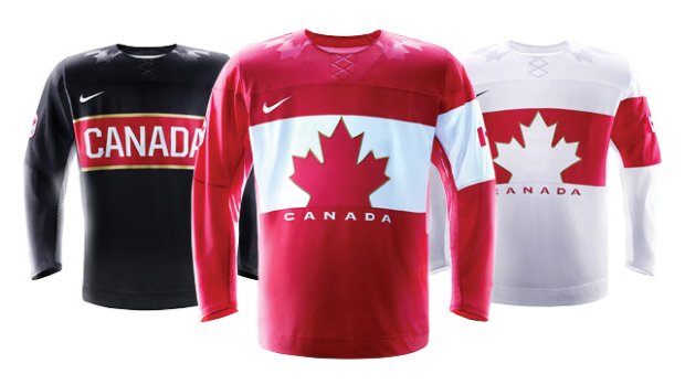
So what do you think of the sweaters the Canadians will be wearing in Sochi?

2014_olympics_three_jerseys_640original_127301.jpg
 
The white and red jerseys look like ad for Petro Canada :)
The black is cool but they should have made a black like the other two.

I don't like the Nike logo, to me this is a Countries flag so why a corporate logo.
Yes, I am guessing Nike funded the jerseys because we are busy paying for fighter jets we do not need and stealth snow mobiles for the arctic.
 
The white and red jerseys look like ad for Petro Canada :)


This^

They look a little too retro for my liking. I wish they could still use the same logo as Hockey Canada, to me that logo is so much better
 
Fugly jerseys. I really start to dislike Nike products. All football (soccer) teams that switched from whatever companies to Nike now have either weird or ugly jerseys.
 
Those faux laces at the neck are hideous as are the other embossed shiny maple leaves on the shoulders. The armbands on one sleeve look very fascist. I like the black and think it looks good with black pants and socks.
men.jpg


At least we don't have to look at these anymore.
team-canada-mustard-jersey_display_image.jpg
 
i dont like it in white, red is much better, black looks like a rugby jersey to me but id still rather see the black one than the white. they definitely arent the worst or the best we ever had
 
Looks like a cheap set of beer league jerseys. They'd probably look better designed by some douche like Ed hardy.
 
They look like an ad for Nike. Is the "Canada" representing where they're made?
 
plenty will still be sold despite the fact that they're not particularly nice looking...its about the almighty dollar after all... same Hockey Canada who couldn't pony up money for insurance for actual ice hockey practice, but rather ball hockey...
 
The armbands on one sleeve look very fascist.

Come on man, lmfao. Don't be so Canadian about it eh?

I like retro. I think retro should've been done MUCH better considering these are representing the countries (since Nike made travesties for everyone so far).

Fugly jerseys. I really start to dislike Nike products. All football (soccer) teams that switched from whatever companies to Nike now have either weird or ugly jerseys.

They have to, Adidas has "Stripes", Reebok has the "minimalist but effective" thing down, Nike seems to do "weird patterns and fluff".

You wanna see fugly kit, check out Liverpool's Away and 3rd kit from this and last season. WTF Warrior?
 
Last edited:
Nike did the US jerseys with the same shiny shoulders treatment but with stars instead of maple leaves. They also made the crest look like to logo of another shoe manufacturer.

5201-04-hockey2.jpg
kswiss_logo_color.jpg
 
I like the Black one but as other had said the red and white look a little too Petro Canada for me.
 
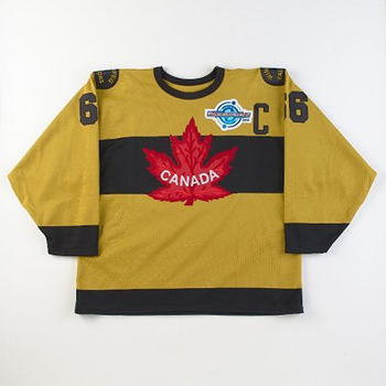
whats wrong with the older ones?

392teamcanada_jerseys.jpg

can't use these ones as they are the official logo of hockey Canada and considered a corporate logo and not eleigible for represenntation at the olympic Level, they can be used in World Cup and other no Olympic ventures. There was some agreement that expired before Vancouver that meant they could no longer use logo above

I'm sure my explanation isn't completely accurate and somebody may be able to better explain or read the link below

http://blogs.vancouversun.com/2009/02/10/hockey-canada-logo-and-others-banned-by-ioc/
 
Last edited:

Back
Top Bottom